April Recap: tidyverse
On April 14th, R-Ladies Philly hosted our first virtual meetup event. It was an exciting interactive workshop on tidyverse, led by our member Kelsey Keith. Kelsey is an associate bioinformatics scientist at Coriell Institute for Medical Research, who uses R daily to wrangle, test, and visualize data.
We are in the future! Our first VIRTUAL workshop! It's a tidyverse introduction led by @kelseykeith42 pic.twitter.com/j8oLUQWXPZ
— R-Ladies Philly (@RLadiesPhilly) April 15, 2020
Tidyverse and tidy data
Tidyverse is a collection of R packages that share an underlying design philosophy, grammar, and data structures, and evolutionarily changed how to program in R.
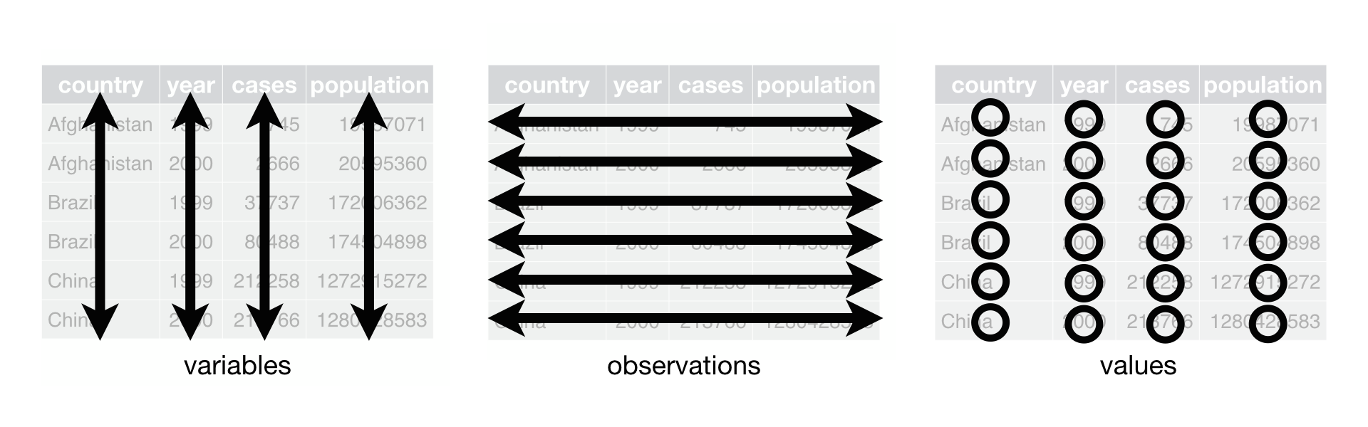
Kelsey started the workshop by explaining what “tidy data” is. Tidy data is a data structure where each column represents a variable, each row represents an observation, and each cell contains only a single value.
Workshop content
The workshop covered the following four basic aspects of tidyverse packages using the iris dataset.
- reading data with
readr - tidying data with
tidyr - wrangling data with
dplyr - visualizing data with
ggplot2
The materials for this workshop are available online:
- Slides: bit.ly/rlp_slides
- RStudio Cloud: bit.ly/rlp_rscloud
Pipe the code
One evolutionary grammar of tidyverse is the pipe operator, %>%. The pipe takes the output of one function and gives it to the next function, allowing you to carry out separate operations in a fluid and readable manner.
read_csv("iris_data.csv") %>%
  select(Species)
Tidy your data
The useful commands to tidy your data up include
pivot_longer()andpivot_wider()to reshape the dataseparate()andunite()to split or combine the columns
In the workshop, Kelsey offered a version of untidy iris data and led an interactive practice to convert the untidy to tidy. Try it out!
Wrangle around
Data wrangling is the most basic but essential step for any data project. To organize the data into the form you want it in, try
arrange()sorts by column(s)select()picks only the column(s) you wantfilter()selects a subset of observations according to some criteriamutate()adds an additional column onto the tablesummarize()withgroup_by()reduces the data down to some summary statistics based on defined group
Visualize it!
Data visualization provides an effective and straightforward way to present your data and to communicate with audiences. Rladies Philly hosted a specific data visualization workshop last June, in which Jake Riley shared helpful tips and best practices about ggplot2. However, data visualization is always a hot topic to talk about, isn’t it?
In tidyverse workshop this year, Kelsey made the data visualization accessible to complete novices and provided examples of density plots, boxplots, and scatterplots.
The following plots show an example scatterplot with linear regression between sepal width and sepal length independently in iris species.
library(tidyverse)
ggplot(iris, aes(x = Petal.Width, y = Petal.Length, color = Species)) +
  geom_point(alpha = 0.75) +
  geom_smooth(method = 'lm', se = F) +
  theme_classic()
At the end of thevvisualization part, we discussed several ggplot extension packages to make your plot more appealing.
ggbeeswarmto make your points in scatterplot like a “bee swarm”cowplotandpatchworkto organize multiple ggplots together easily.xkcdto make ggplot2 graphs in XKCD style
Thank you
Many thanks to our great presenter Kelsey Keith.
This post was authored by Chun Su. For more information contact philly@rladies.org